Introduction
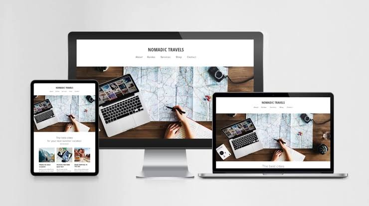
In today’s digital world, responsive website design has become a core requirement for any modern website. With the increasing use of various devices such as mobile phones, tablets, and laptops, websites must be built in a way that they display correctly and consistently across all screen sizes. A strong approach to responsive website design not only improves the user experience but also has a significant positive impact on search engine optimization (SEO). In this article, we will explore the best practices for responsive website design in 2025 and take a deeper look at the techniques that make websites more flexible, accessible, and performance-driven.
1. Understanding Responsive Design Principles
1.1. The Concept of Responsive Design
Responsive design means creating websites that automatically adapt to the size and resolution of the user’s device screen. This type of design involves the use of flexible grids, images, and CSS that allow the website to display optimally on any device. This design allows users to easily access content without having to zoom in or out.
1.2. The Importance of Responsive Design
– Better User Experience: Users expect websites to display well on different devices. Responsive design helps improve the user experience and encourages users to stay on the site.
– SEO: Search engines give higher rankings to responsive websites because they do not need to create different versions for different devices. A responsive website helps search engines index its content better.
– Reduced costs: By designing a responsive website, there is no need to create and maintain separate versions for mobile and desktop. This can help reduce development and maintenance costs.
2. Using Responsive Design Frameworks
2.1. Bootstrap
Bootstrap is one of the most popular responsive design frameworks that allows developers to create websites with beautiful and user-friendly designs. This framework includes a set of tools and design patterns that are easy to use. Bootstrap has become one of the main choices of developers due to its high customization capabilities and comprehensive documentation.
2.2. Foundation
Foundation is also a powerful framework for responsive website design that allows users to create websites with modern and professional designs. This framework is known for its high customization capabilities and advanced features. Foundation allows developers to create very flexible and user-friendly designs using various tools.
2.3. Tailwind CSS
Tailwind CSS is a utility-first design framework that allows developers to easily and quickly create custom designs. This framework is rapidly gaining popularity due to its high level of customization and the lack of need to write additional CSS. With Tailwind, responsive designs can be easily implemented using ready-made classes.
3. Designing Flexible Grids
3.1. Using CSS Grid and Flexbox
CSS Grid and Flexbox are powerful tools that allow developers to create complex and flexible designs. Using these techniques, it is easy to arrange elements on the page and make the most of the available space. CSS Grid allows you to easily implement 2D designs, while Flexbox is ideal for 1D designs.
3.2. Relative Sizes
Using relative sizes, such as percentages and vh and vw units, instead of fixed sizes, helps the website automatically adapt to changing screen sizes. This technique is especially useful when designing for different devices. For example, using `width: 50%;` instead of `width: 500px;` can result in a more flexible and user-friendly design.
3.3. Media Queries
Using media queries allows developers to define different styles for different screen sizes. This helps the website to automatically adapt to changing screen sizes. For example, you can define mobile-specific styles using the following code:
““css
@media (max-width: 768px) {
/* Mobile-specific styles */
body {
font-size: 14px;
}
}
““
4. Optimizing Responsive Website Design Images
4.1. Using the Right Formats
Choosing the right format for images can have a big impact on the loading speed of your website. Formats like WebP and AVIF are recommended due to their better compression and high quality. These formats can significantly reduce the size of images while maintaining image quality.
4.2. Lazy Loading
Lazy loading means loading images only when the user approaches them. This technique helps reduce the initial load time of the website and improves the user experience. By using the `loading=”lazy”` attribute in the `<img>` tag, this feature can be easily implemented:
““html
<img src=”image.jpg” loading=”lazy” alt=”Description”>
““
4.3. Optimize Image Size
Before uploading images to the website, they should be optimized. Using tools like TinyPNG or ImageOptim can help reduce the size of images without reducing quality. This is especially important for websites with large images.
5. User-Friendly Navigation Design in Responsive Website Design
5.1. Drop-Down Menus
Using drop-down menus allows users to easily access different sections of the website. This type of design is especially useful on mobile devices. Drop-down menus help users access different sections of the website without taking up too much space.
5.2. Large and Clickable Buttons
In responsive website design, buttons should be large enough and clickable so that users can easily interact with them. Small buttons may be difficult to access on mobile devices, so large sizes and appropriate spacing between buttons should be used.
5.3. Sticky Navigation
Using sticky navigation allows users to access the menu anywhere on the page. This feature is especially useful on long websites, as users can easily access different sections of the website without having to scroll to the top of the page.
6. Testing and Evaluation
6.1. Testing on Different Devices
Testing a website on different devices is an important step in responsive website design. This allows developers to identify and fix problems and flaws. Using simulators and testing tools can help identify problems.
6.2. Using Testing Tools
Tools like Google Mobile-Friendly Test and BrowserStack help developers evaluate the performance of their website on different devices. These tools can help identify design problems and optimize the website.
6.3. Collecting User Feedback
Collecting feedback from users can help improve the website design. Using surveys and data analysis tools, you can identify the strengths and weaknesses of the website and improve the user experience accordingly.
7. The Future of Responsive Design
7.1. Artificial Intelligence and Machine Learning
In 2025, advances in AI and machine learning could help improve responsive web design. These technologies can automatically optimize designs based on user behavior. For example, websites can automatically display content based on user interests.
7.2. Augmented Reality and Virtual Reality
With the spread of augmented reality and virtual reality, website design should also support these technologies. This can significantly improve the user experience. For example, e-commerce websites can allow users to view products in their real environment.
7.3. User-Centered Design
In the future, website design should be more based on the needs and interests of users. By using big data and analyzing user behavior, designs can be created that are optimized specifically for each user.
Conclusion
Responsive website design has become a necessity in 2025. By using the right frameworks, flexible grid design, image optimization, and continuous testing, websites with a great user experience can be created. Also, with the advancement of new technologies, the future of responsive design looks bright and developers should be ready to embrace these changes. Given the increasing importance of user experience and optimization for search engines, responsive design will become one of the key factors for the success of websites.


Leave a Reply